CSC Cloud Services Application:
Design & Style Guide
Building a prototype to gain executive approval to keep development in-house
A CSC VP wanted to go with an external solution. CSC developers needed a prototype for their retail cloud project that would convince management to keep product development in-house.
“Janet is a star player who I have always enjoyed working with. Her level of detail and quality of work is some of the the best I have seen. Whether she is doing design work, graphics, technical documentation, QA, or just using the great mind she has, Janet is someone I would highly recommend her.”
The Project
CSC development had spent time working on code for a “Transparency As A Service” solution. It was the groundwork for a robust back-end for dealing with issues in talking to multiple back-end enterprise systems, and delivering a solution that would be synergistic with the performance, usage, audit, trouble ticket and other back-end reporting systems.
But, CSC had an aggressive timeframe to deliver their retail cloud solution to customers and the VP wasn’t convinced they could do it…
My Role & Challenge
My job was to assist CSC Development in designing a solution and proptype that would convince executives to keep product development in-house.
We had a short time-frame to design and build a viable front-end solution that would not only be user-friendly for CSC customers but convincing to CSC decision makers. It also needed to be a “prototype” that could be a good step towards release ready.

The Style Guide
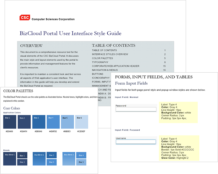
I authored a style guide, for the baseline and standard for all development on the project going forward. It ensures that design elements are standardize and consistent, and gives the programmers code samples they can copy.
This style guide defines the visual elements, interaction components, and was a summary of all decisions made as I collaborated with development on the design of this product; and it includes:
- page types and templates
- color palettes & typography
- header design
- navigation and menus
- buttons
- iconography
- forms, input fields, and tables
- management and report console features
- search and filtering features
- design best practices
- framework references and css code

Proto-Personas
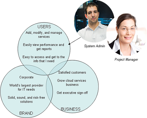
At the beginning of the projects, I interviewed and brainstormed with the team to put together proto-personas. This allowed us to further identify our users, and their goals and needs.

My Other Deliverables
- Theming & Corporate Branding
I presented a clean “look & feel” that would be appealing to CSC customers, yet at the same time, contain elements of CSC corporate branding to gain confidence. - Architecture & Page Templates
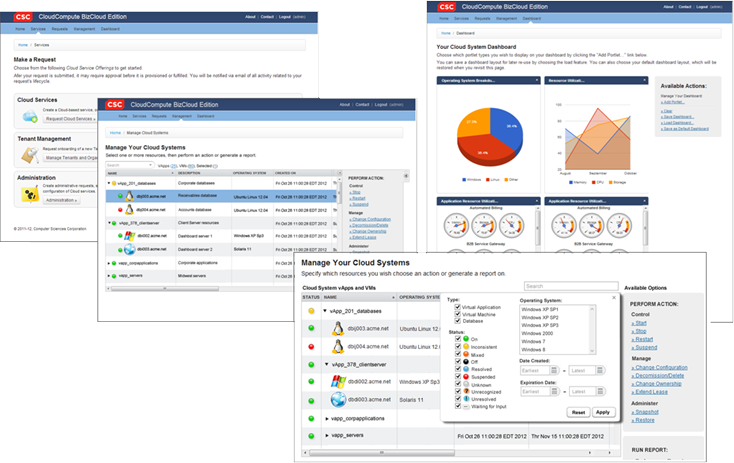
I looked at the main user tasks to determine the architecture of the site…the main navigation needed to reflect the main things that the user needed to accomplish. And from there, I used grid layouts to layout components on the pages. Light gray shading added additional visual focus to the features and functionality. - Management & Reporting Consoles
I looked at how the user might perform various actions to manage and administer their systems. I loved this extra panel on the right that gave the user instant visibility into what they could do from this portal — they didn’t have to look hard for options or take a bunch of extra clicks to get there. In this way we can guide them in a non-intrusive way. - Filtering
I provided mockups for users to search and filter their systems, with advanced options readily available in one dialog/panel. - Icon Library
A set of beautiful icons was highly important to the acceptance of this product. CSC’s CTO asked me for more and more saturation and punch!
The Results
We got Executive approval to move forward! I delivered:
- A design that was inline with CSC corporate branding to give CSC customers confidence with the service offering.
- High fidelity mockups allowed the VP to visualize and give feedback. More importantly, gave him what needed to feel good about making the decision to keep development in-house.
- Design elements and CSS code to the developer when he needed them for a fast turn around on prototype code.
Janet B Wayland
Other UX Technical Writing Projects
NFCU Digital Media
BoomTown API
NetIQ Operations Center End-User and Developer Documentation
Configuration Management System
NetIQ Operations Center (NOC)