User Experience & Product Design
UI/UX : Enterprise Level Software Solution
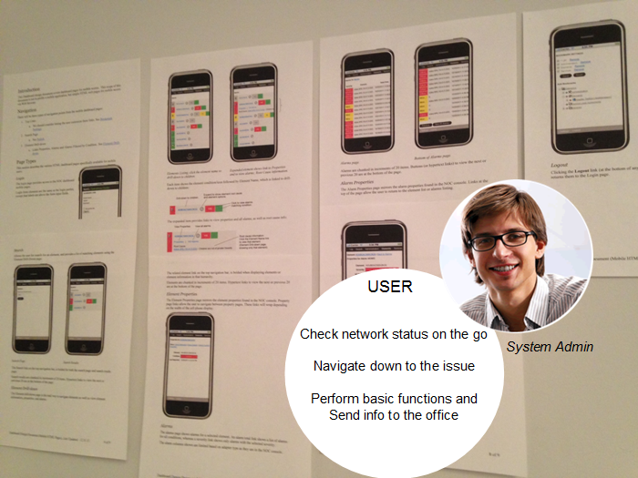
NetIQ Operations Center— NOC is enterprise level software that helps corporations to manage disparate network management systems. I provided UI/UX design for this solution for 12 years. It was a robust solution that solved very complex problems in super customizable ways. Back in 2001, it was created by Managed Objects, and then later acquired by Novell, and then Attachmate NetIQ.
User Personas – Mobile App – Integrations & Charting – Charting Redsign – Portlet Configurations
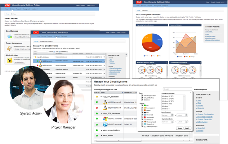
Design & Style Guide : Cloud Services Application
CSC — The VP at CSC wanted to go with an external solution. CSC developers needed a prototype for their retail cloud project that would convince management to keep product development in-house. We had a short time-frame to design and build a viable front-end solution that would not only be user-friendly for CSC customers but convincing to CSC decision makers. It also needed to be a “prototype” that could be a good step towards release ready.
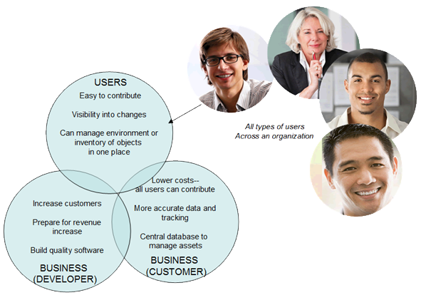
A crowd-sourcing solution to maintain CMDB repositories
Managed Objects myCMDB — Managed Objects wanted to come to market with a new product. I worked with the development team to provide a blueprint for visual direction and user interaction design. I started with an overall mission statement provided by the CTO and a brainstormed list of feature requirements. With that, I set to work on a large set of high resolution mockups. When development was underway, I collaborated with the team to provide CSS code, refine interaction design and solve issues.
special projects: Google Maps, Knowledge-Base Integration & Best Practices
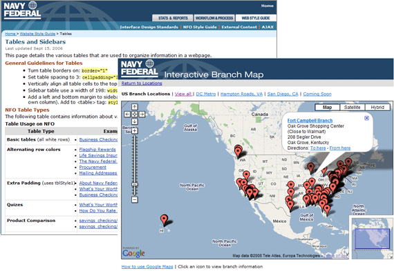
Navy Federal — The NFCU digital team needed help with some of their larger, more technical projects. In some cases, it was a matter of laying out specifications and managing the projects. For others, we rolled up our sleeves to do production work. These projects included a branch locations database redesign, implementing Google Maps, integrating with the RightNow knowledge-base solution, and creating a Digital Media Intranet for best practices and legacy information.
Responsive Web Portfolio
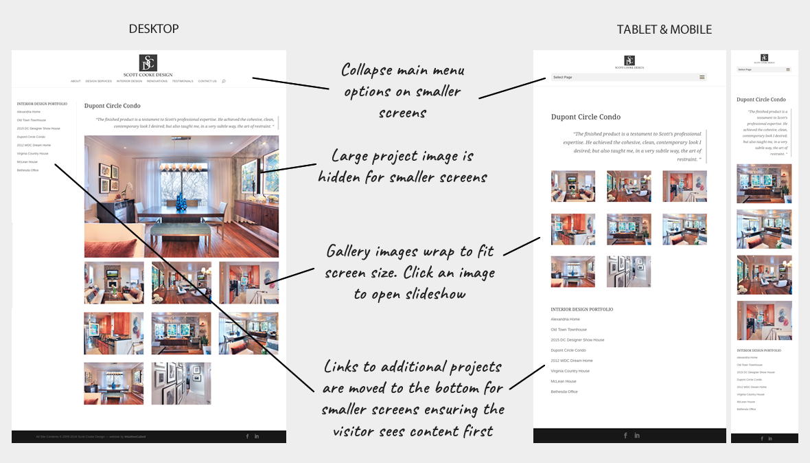
Scott Cooke Design, Interior Design Agency — Scott Cooke knows good design. I worked on an elegant redesign to a site that was nearly a decade old.
I always make sure my clients’ sites are responsive to all devices, but with Scott’s portfolio pages, I had to put in some addional fixes to enure a good experience across all size screens. Take a look to see more about Scott’s website solution…
Responsive self-study Course & Reference Materials
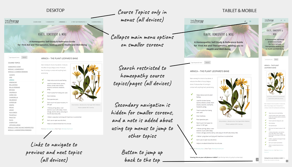
Lisa Hawkins, Online Homeopathy Course — Lisa is an entepreneur in New Zealand, she is also brilliant with homepathy and passionate about sharing her knowledge. After I redesigned her website, I built her course pages right there in WordPress as a good solution until she can afford one of the more robust courseware systems.
Take a look to see what I did to make her course function gracefully for desktop and mobile users alike….and see what I found in testing that really needed a better fix…
Online Assessment Tool
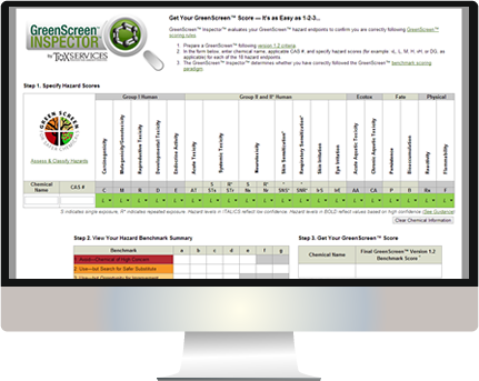
ToxServices — ToxServices chemists had developed an evaluation tool using an excel spreadsheet. Now, it was time to take it online as a free tool (GreenScreen Inspector) that would generate leads and business for their other consulting services. Their programmer contacted us in a panic. He was working on the programming for the GreenScreen Inspector tool, but couldn’t figure out the css code on the vertical text in the matrix. He was convinced we needed to create a graphic for each one. We went to work on the css to update table styles and handle all text, so no graphic labels were required. When we discovered that the page was a mess usability-wise, and that it offered no company branding for ToxServices, we recommended changes to improve user experience, and provided the HTML and CSS code to implement…

